Design Stories
Inside Design Stories
How to enhance usability and visual harmony in user interfaces?
The Typography Section of the User Experience (UX) Design Team discusses
its User Interface (UI) design system.
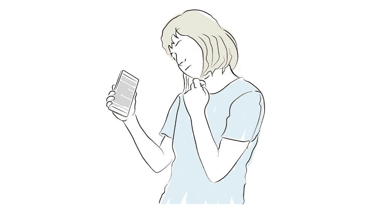
If all the text appearing in a particular app was presented in typefaces of the same size, the app would probably be quite difficult to use.
Should the heading be larger to stand out? How much smaller should the body text be, relative to the heading? “Text size design” is an essential aspect of creating an interface that is both clearly legible and easy to use. To meet this creative challenge, Sharp employs its innovative design system.
What’s interesting about this design system is that it chooses type sizes relative to the pleasing sounds we experience in a musical scale.

The series of notes rising in pitch in the scale do-re-mi-fa-so-la-ti-do as played, for example, on the keys of the piano sounds very pleasing to the ear. If we express the frequencies in this scale in hertz (Hz), a numerical value that represents the pitch of a note, we can see that the interval between each note is roughly similar. In other words, the span of this scale creates an agreeable sequence that we experience as satisfying. Sharp’s Design System applies this phenomenon when developing the sizes of typefaces; specifically, the intervals between the various sizes of a particular typeface used on the screen are similar to the intervals that occur in the do-re-mi musical scale.
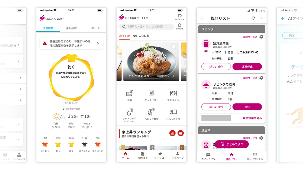
This typeface system was developed by using the musical scale to determine the intervals that humans naturally find agreeable. This approach resulted from an effort to determine an easy-to-read and functional screen no matter what layout is displayed. Do you experience a pleasing visual harmony when viewing the screen? After reading this article, please take a look at the design of Sharp’s mobile app.