AQUOS R5G
Characteristics felt without realizing it
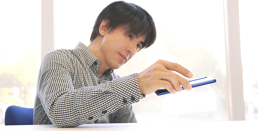
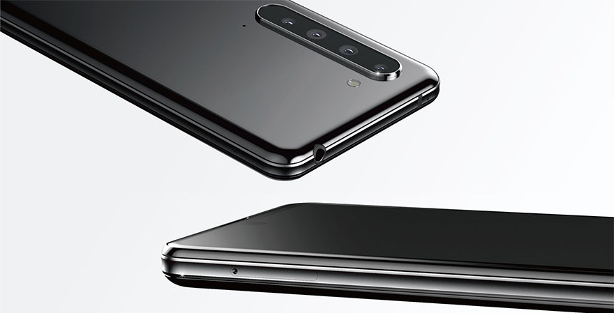
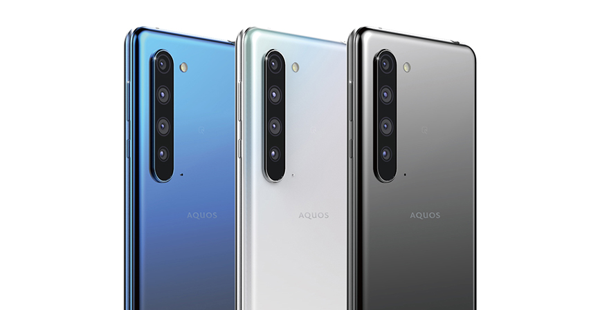
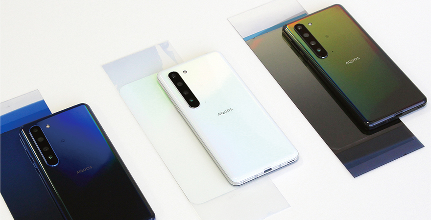
Here, I focused on the value of everyday use. I went back to the basic use of smartphones and wondered if I could extract the charm of a smartphone through its design. Although I find that it is difficult to not make a design boring, I tried to highlight certain characteristics by focusing on smartphone usability as a tool. The minus curve on the sides makes it easy for a user to pick up the smartphone when it is upside down, and the plus curve on the back fits into the user’s hand naturally. The characteristics of the smartphone are born from these minute shape considerations, and users will feel the difference in comparison to other smartphones. Even though the colors are basic, the color changes depending on the reflection of light. We applied soft gradations to the smartphone to ensure that the rainbow colors of the hologram do not appear too extreme. I hope that the usability will become a characteristic that users do not actually notice and that they can naturally fall in love with the smartphone the more they use it.
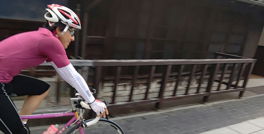
As for my hobbies, I often ride my bike on my days off. When I ride for a long time, my body starts to ache. To reduce soreness, I replace parts, remodel my bike, and sometimes even change the way I ride, and I try to get the best of both myself and my bike. I believe that a fountain of ideas lies in the relationship between humans and objects.
Related information
Note: The department that the author belongs to and the content of the article are correct at the time of writing.
Product
芝田 博和
Hirokazu Shibata
