bitescan
Designed for Proper Chewing
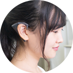
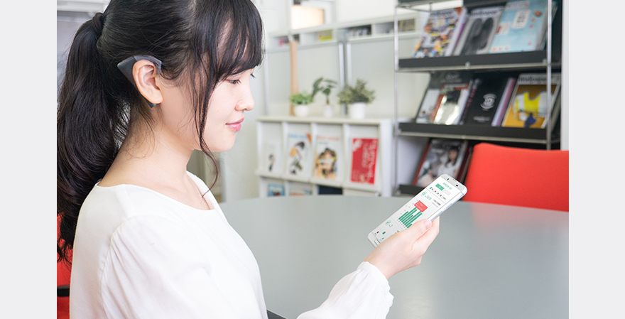
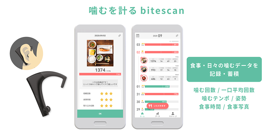
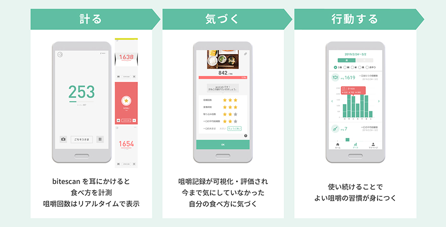
The “bitescan” product is a mastication meter that the user puts on their ear when eating to measure the number and tempo of chews, along with the position of the jaw, while chewing. I designed the app with the aim of making it fun and helping the user develop good chewing and eating habits. A key point of the bitescan app user experience is that it has been designed such that the user will want to use it every day. However, if the app only displayed that day’s chewing data, the user would gradually get tired of using it, so I researched the true user experience when using the app so as to discover what would make them want to use the app again and again each day. As a result, the key feature of the design that I created is a graph that helps the user easily see the trend in changes to their actions. The simple design conveys the data on changes to user habits and their daily improvements in order for the user to be able to see how their effort is having an effect. I also incorporated into the design some badges that praise continued use and a calendar that makes review easy, and this helps the user maintain motivation for continued use.
I enjoy people watching. Seeing people go about their daily lives, like watching a parking attendant dry off bicycle seats after rain or seeing children find discounted vegetables at the supermarket, boasting to their mother as they give them the vegetables, or observing a shy waiter at an Indian restaurant smile as he gives a customer more nan —these things really put a spring in my step.
Related information
Note: The department that the author belongs to and the content of the article are correct at the time of writing.
UX
望月 愛海
Manami Mochizuki
