Dandori Navi
Enabling anyone to be able to cook two or three dishes at the same time
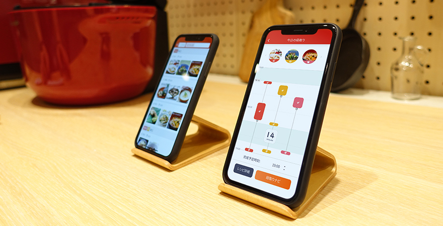
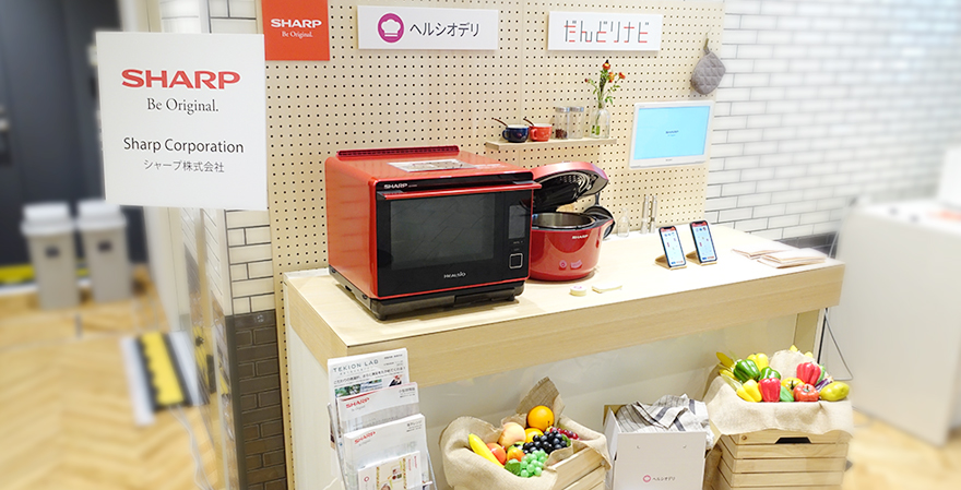
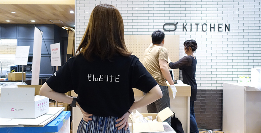
Making a nutritionally balanced meal can be tiring. Dandori Navi is an app that shows you the steps for making two or three dishes for a meal at the same time. Selecting a menu in the app also visualizes the steps, allowing the user to create a menu that suits their lifestyle while looking at the total cooking time and free time while simmering food, and such like. Furthermore, if the user links the app to their smart cooking devices, the user can enjoy making two to three dishes without even being in the kitchen! I worked with my teammates in every step of the design process, from research and analysis to proof of concept, prototyping, and preparation for exhibition at events. We are working on improving Dandori Navi every day so that people who want to make a proper meal can have even a bit of extra time while cooking. And we’ve been trying to show off Dandori Navi to the world so as to look for partners to commercialize the app. More than anything, it is gratifying as a UX designer when people I meet through these activities say “Wow!” in regards to the app.
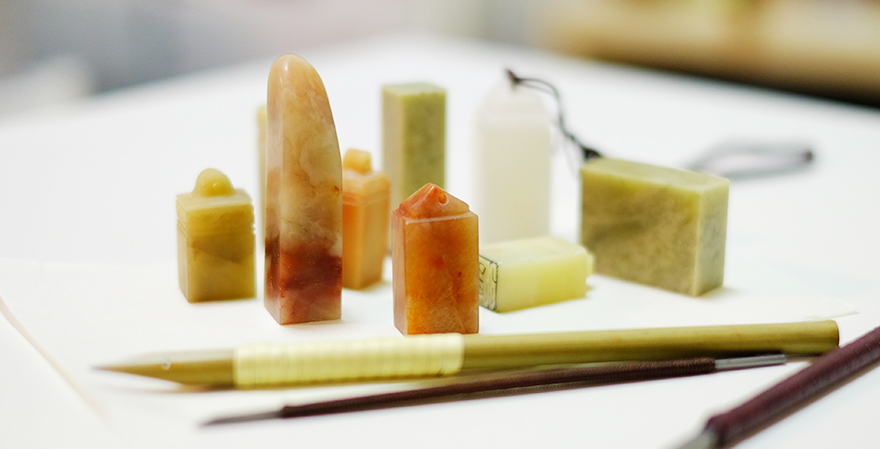
I like watching documentaries, which I feel broadens my view of the world. There are wonderful stories as well as tragic stories, all about flora, fauna, space, humans, and many other subjects. These stories move me because they are true. When I don’t want to be moved in that way, I do stone carvings.
Note: The department that the author belongs to and the content of the article are correct at the time of writing.
UX
寧 静
Ning Jing


