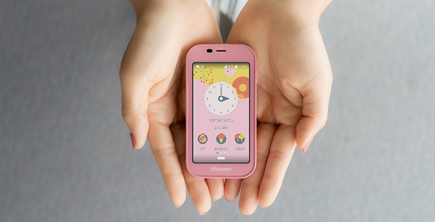
Kid's KeitaiSH-03M
User interface that grows with children
I sought a design that enables children to experience their own growth. In a single year, children change significantly both physically and mentally. For this reason, to have children use and feel attachment to this mobile phone for a long time, I thought it was necessary to change the design shown on the display and make that change something that children could enjoy.
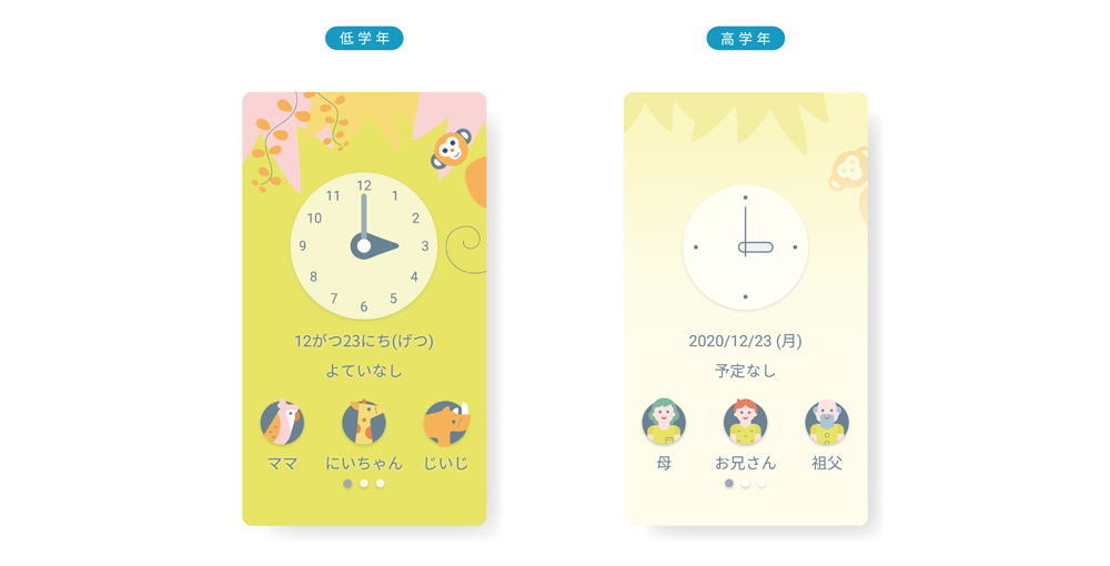
The points I focused on for the growth of children were “increased academic abilities” and “preference changes.” For example, I made it so words that are shown in hiragana script during early school years change to kanji characters in later years. In addition, the design of the clock can be changed from one that is easy to read, showing numbers for the 12 hours along with long and short hands, to a simple design that omits numbers. By making the design linked to childhood development in this way, I believe the children should feel that the change of the design shown on the phone parallels their own growth. This Kid’s Keitai not only increases knowledge, it also grows together with the child.
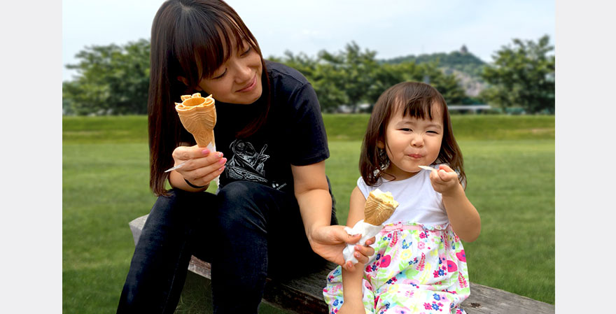
I have numerous “realizations” as I spend time with my child every day. Sometimes children have ideas that really capture the essences of things. This reminding us of perceptions that we forgot when we became adults is a precious experience.
Related information
Note: The department that the author belongs to and the content of the article are correct at the time of writing.
UX
佐藤 麻伊子
Maiko Sato


