Water OvenAX-XW600
A system for growing accustomed to such products
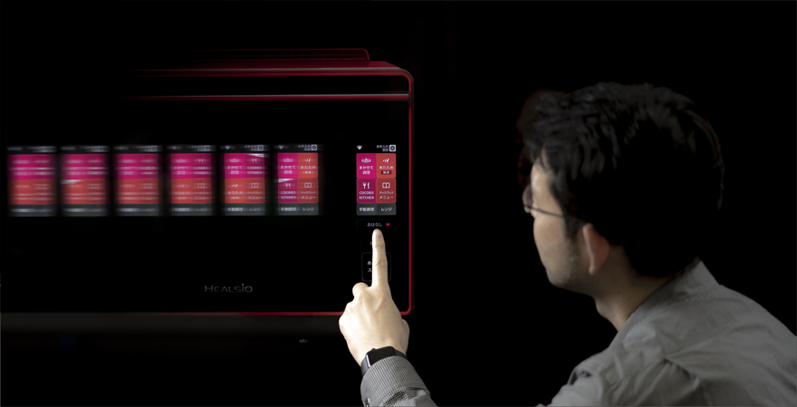
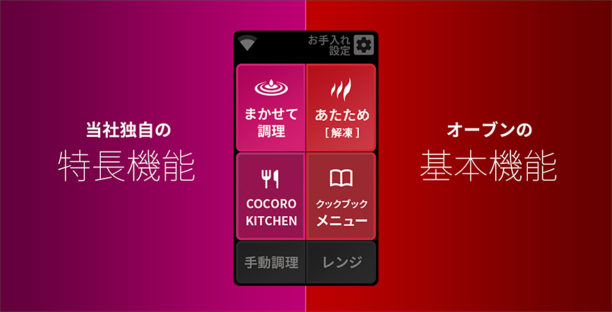
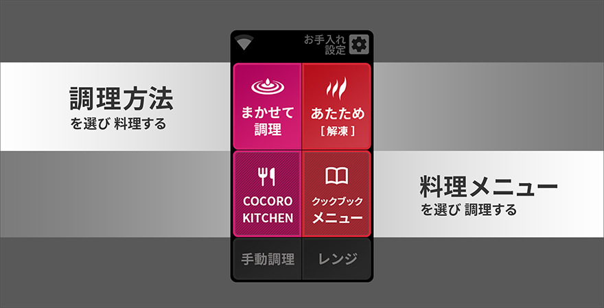
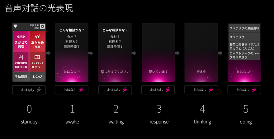
Although the Healsio, marking its 16th year since launch in 2019, is equipped with a large number of features and can be used in many different ways, how to provide all those features in an easy-to-understand way was a challenge. Hence, we divided the features into a cooking menu that uses the Healsio cooking tools at the top and a recipe menu from which users select what they want to eat, at the bottom. Additionally, we put special Sharp-proprietary features on the left and basic oven features on the right, so as to organize the oven into four sections in terms of how the customer will want to use it. Through this configuration, customers can enjoy the oven with peace of mind when they want to use a cooking method or recipe that is a bit different to what they usually might use, simply by looking at the screen, so I think that we’ve created a system that allows customers to naturally grow accustomed to this type of product. Moreover, we’ve incorporated light to express smooth conversation of the customers when communicating with the product, while using our AIoT pink color scheme for the parts that show Sharp-proprietary “intelligence.”
In my private life, I look for and try out various devices that stimulate my everyday life—for example, recently I’ve been checking out omnidirectional (360-degree) cameras and VR/AR headsets—to enjoy my ever-changing everyday life while imagining what a future looks like when these devices become commonplace.
Related information
Note: The department that the author belongs to and the content of the article are correct at the time of writing.
UX
田畑 雅基
Masaki Tabata
